How I make motion graphics with HyperFrames and Claude Code
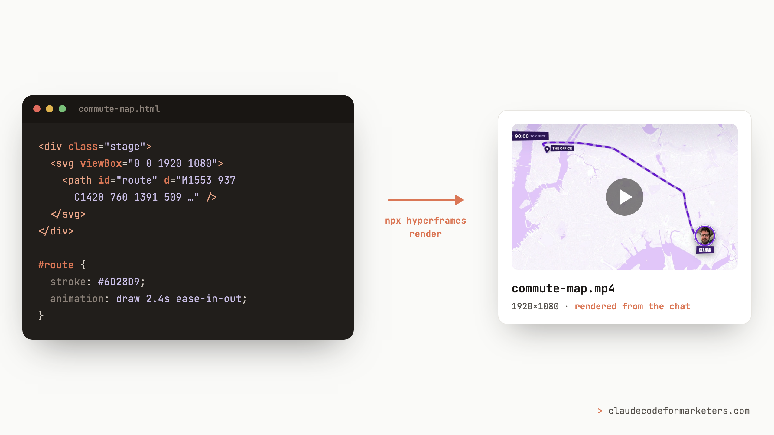
I was putting together a video about building a Retool app while on the train, and I wanted those slick animated map graphics like you see on The Amazing Race or Jetlag: The Game. You know the ones: a line draws itself across a city, a little countdown ticks down in the corner, and a marker slides along the route while the host narrates. They make a video feel produced.
The problem is that I am not a motion designer. I’ve never opened After Effects and come out the other side with something I’d actually show anyone. For a long time that meant graphics like these were simply off the table for me, or they meant paying someone who does own After Effects and knows how to drive it.
That’s the gap a tool called HyperFrames filled for me, and the way I use it is a little different from what you might expect.
What HyperFrames actually is
HyperFrames is a tool that treats a video as a web page. You write the composition in HTML, CSS, and a little JavaScript, and it renders that page out, frame by frame, into an MP4.
If that sounds like something you’d need to be a developer to build, that’s where this particular post comes in. I don’t write the HTML, Claude Code does. I describe what I want in plain English, Claude writes the composition, and I run two commands to see it: npx hyperframes preview to watch it in the browser, and npx hyperframes render to export the final MP4. Both of those run right from the Claude Code chat, so I never leave the one window.
The reason this matters, and the reason it works so much better than asking an AI to generate a video directly, is that the output is code (which CC is very good at). A generated video is a black box: if one thing is wrong, you have to regenerate and pray, whereas a composition is editable. When something’s off, Claude changes the specific line that’s off and re-renders, and everything else stays exactly where it was. Let’s see what that actually looks like with two specific examples.
The map that had to be a real map
For the map graphic that I wanted, I pasted my narration script into Claude Code, attached a couple of reference screenshots from Jetlag, and told CC about the color scheme I wanted (I was thinking purple, monochromatic). Then I asked it to do something before building anything: first figure out where in the script these map graphics should go, and then write the prompts to build them.
That “plan it, then build it” step is worth diving a bit deeper into because I didn’t hand over a pixel-perfect spec. I handed over the intent and the references and let Claude develop the detailed spec itself. It came back with the insertion points and a build plan, I told it to put my face on the traveler marker, and we built the first card.
The first render was close. Structurally, it was already a Jetlag-style map: purple basemap, a countdown chip in the corner, a marker with my face in it. But the route was wrong. It was just some diagonal lines cutting across the city, not the actual path I’d take to the office.
So we started refining. And this is where these maps were different from everything else I’ve built in HyperFrames, because they had to actually be factually correct instead of just looking good. So I gave it the following prompt:
Can we make the route actually follow the route that we’ll take to the office? Right now it’s just some diagonal lines.
A title card just has to look a certain way, but a map has to be right. Luckily, because this was Claude Code, it could actually run through the logic to trace the real AirTrain corridor, then the Long Island Railroad, then the subway into Manhattan, over real NYC geography. After that, I asked for a few visual fixes: swap the palette to monochrome purple while keeping the contrast relationships intact, add ten or fifteen pixels of breathing room between the marker and the “The Office” label, kill a stray purple line that flashed on Manhattan when the animation faded in, and move the tip of the marker so it lands right at the end of the route.
Each of those was a specific fix rather than throwing the whole thing out and starting over. I’d say what was wrong, Claude would change that one thing, and the rest of the composition stayed put. By the end I had a map I could zoom into for each leg of the trip, with the countdown ticking from ninety minutes down to zero as the video moved along.
The title card that needed a specific “vibe”
The next graphic was the opposite kind of job. I was making a separate video about the term “vibe coding,” and I wanted a glitchy title card to open it: neon green on black, some fake terminal error text scrolling in the margins and more.
Because this one only had to hit a mood, I briefed it on the mood. I told Claude about the soundtrack I had in mind and even the search keywords I’d used to find that track, so it had a real reference for the feeling I was going for. That first pass got me eighty to ninety percent of the way there off a single detailed prompt.
The two tweaks after that were exactly what you’d expect for something aesthetic: the text wasn’t quite readable enough, and, honestly, I wanted it to be more glitchy. Both were quick, but here’s what it looks like.
One small gotcha worth knowing if you animate a blur like I did here: my first render had a faint dark band flickering along the bottom edge on certain frames. It turned out HyperFrames renders with multiple workers by default, and they can capture a blur mid-animation in slightly different states. Rendering with npx hyperframes render --workers 1 fixed it cleanly. If you ever see a pulsing band that doesn’t show up in the preview, try that before you go hunting through your CSS.
The trick hiding inside that same video
That vibe-coding video needed one more thing, and it’s not a HyperFrames build at all, but it’s too good a Claude Code trick to leave out.
The clip you saw above isn’t just the title card. It cuts into a montage of recognizable people and news anchors actually saying the words “vibe coding,” in a handful of languages. I didn’t go find those clips. From a single prompt (something like “I’m building a video on the term vibe coding, go find well-known, visually recognizable people and news anchors saying it”), Claude searched YouTube, pulled the transcripts, figured out exactly where in each video the phrase was spoken, and used ffmpeg to cut each clip down to just that moment with a little buffer on either side.
I ran it under the /goal command so it could loop through the whole list on its own without me babysitting each one. It handed me back a folder of trimmed clips. My only job was picking the ones I wanted to keep and dropping them into my editor alongside the title card and the music. The research, the downloading, and the cutting were all Claude.
Refine, never restart
If there’s one thing to take from all of this, it’s the pattern that showed up on every single graphic: be specific about what you want, hand over your references, and Claude gets you structurally close on the very first render. Everything after that is small, targeted tweaks. You are refining, never starting over.
None of this work has made me a motion designer, but it meant the graphics I couldn’t make before are now a prompt (and a few follow-ups) away. If you’ve been leaving your videos plain because the motion-graphics part felt locked behind software you’ll never learn, this just might be your way to get started. It’s the same idea behind why I stopped using AI image generators for infographics: when your visuals are defined as code, you get to edit them like code, and that changes everything about how much you can actually make.
I’d love to see what you build with it. If you make something, or you get stuck, come find me on Twitter or LinkedIn, or just email me at [email protected]. Let’s see that first render!
Join 190+ marketers who have gone through the free 7-day email course and learn how to use Claude Code for your marketing work and get notified when we publish new use cases and ways to stay ahead of the curve.
No spam. Unsubscribe anytime.
"I watched Keanan work magic with Claude [Code] in the terminal. My brain: 'It's far too technical!' 'Dark mode? Not for me!' ...I shipped 4 things in my first month."
 Sarah Sherman Community Builder at Retool